
Living and working at the intersection of how something looks and how it works.
UX, brand systems, communication design, and the occasional animated series. The work spans enterprise software, public sector, automotive, and startup — the through-line is making complex things feel considered.
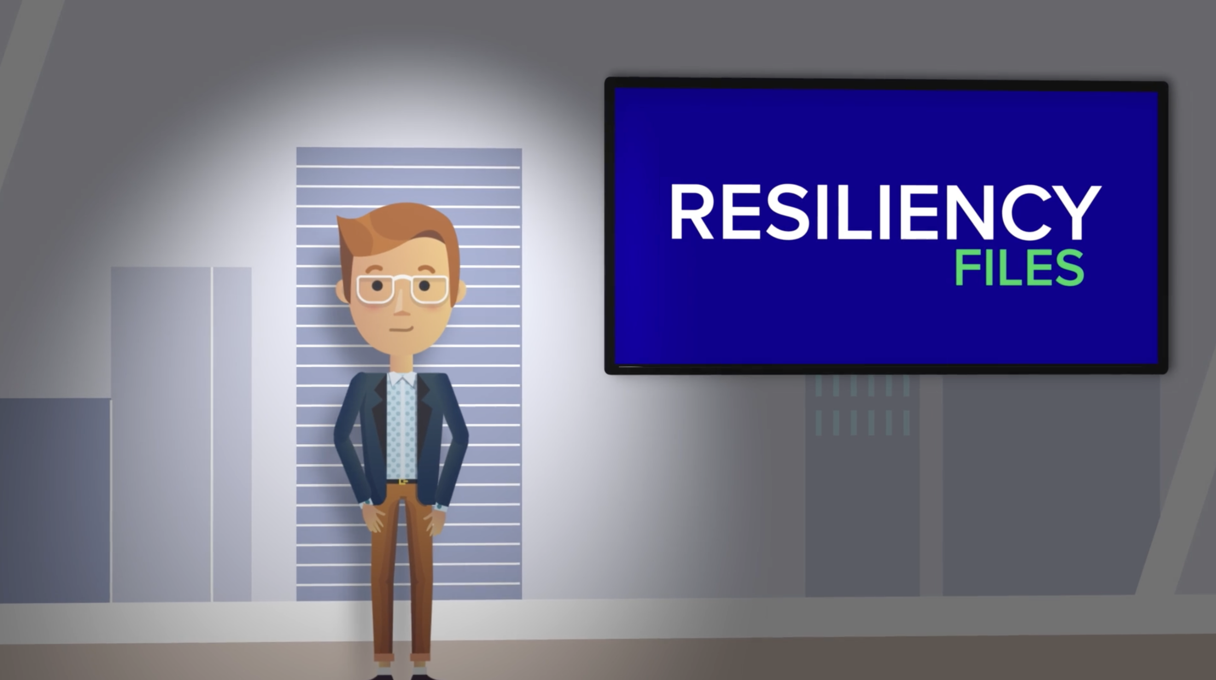
SRE Training Series
The Site Reliability Engineering team needed internal training materials that people would actually watch. Instead of the standard screen-capture videos with bad acting and flat voiceovers, we built an animated series — original characters, visualized core concepts, professional voice talent. Read More »
// produced Animated series, character design, script, art direction, voice direction
// goal Make technical training something the audience chooses to engage with.
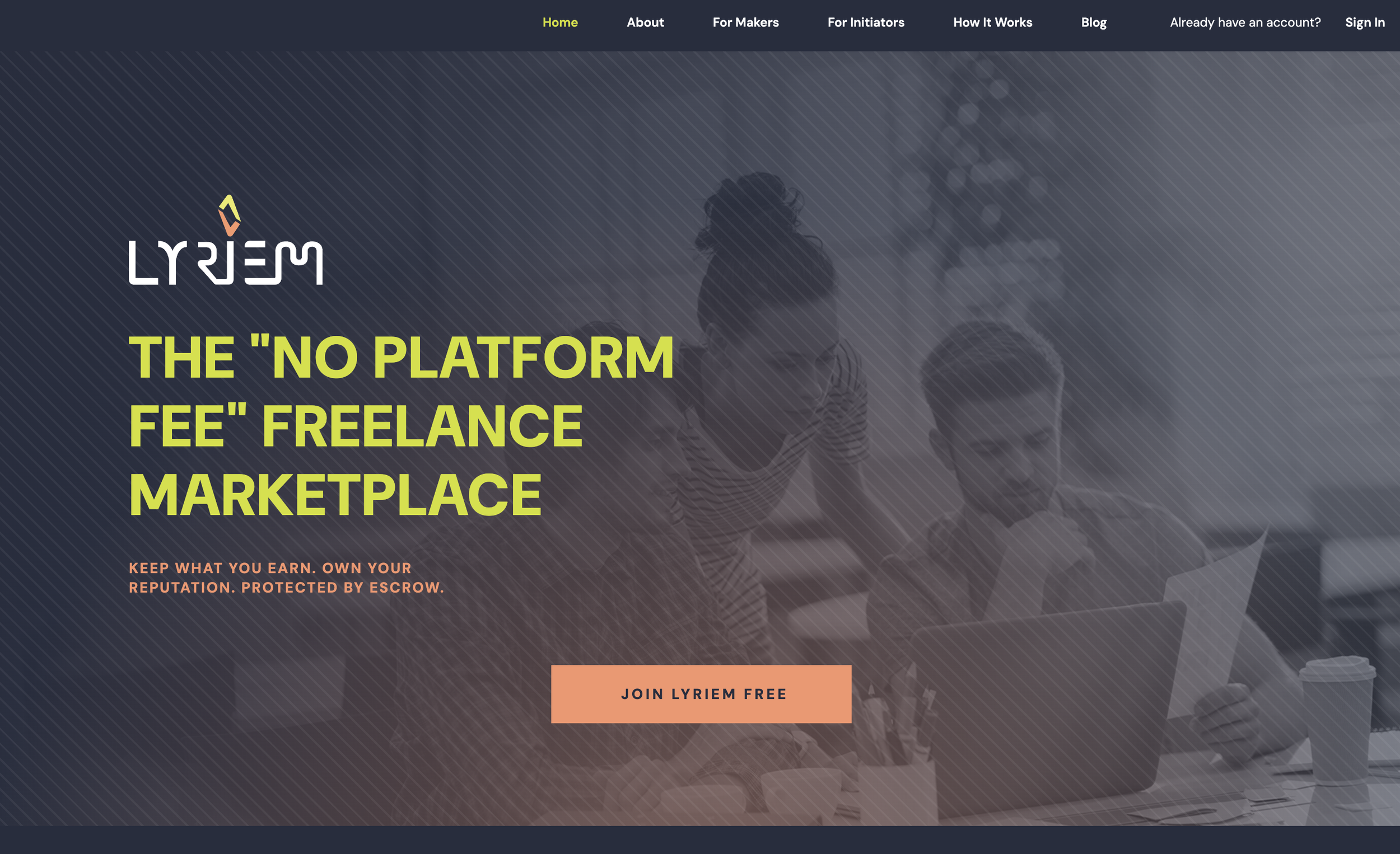
End-to-End Product Design
Lyriem is a no-platform-fee freelance marketplace built to go directly at Upwork and Fiverr. The platform serves two distinct user types — Makers (freelancers) and Initiators (businesses) — each with their own mental model, goals, and trust concerns. The UX covers the full arc: marketing site, onboarding flows, profile systems, project creation and search, a bidding and messaging system, smart contract execution, escrow, and on-chain reputation. Brand identity, visual language, and UI system built alongside the product. Read More »
// produced Brand identity, design system, marketing site, onboarding flows, dashboard UX, messaging UI, project and contract flows, profile system
// goal Make a technically complex platform feel straightforward to both sides of the transaction.
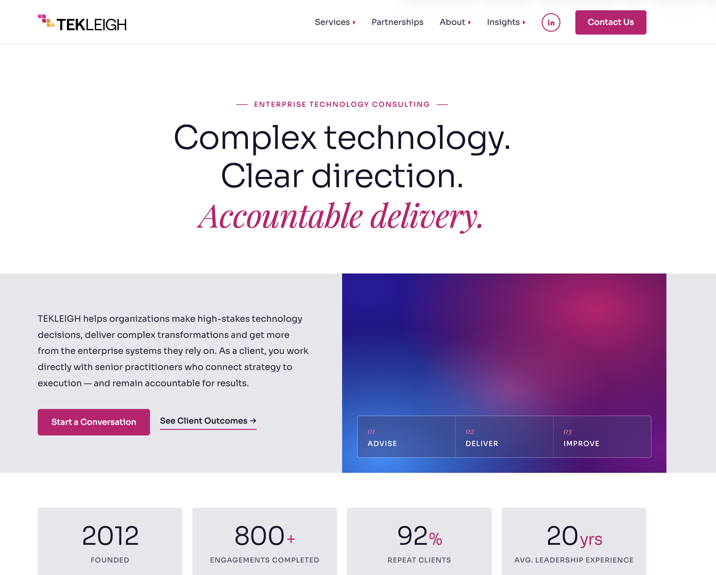
Brand & Marketing Design
Ongoing design partnership with a mid-sized IT consulting firm — covering the full range of client-facing and internal touchpoints. Social media graphics, event signage, and sales materials handled on a rolling basis. Website redesign brought the visual identity up to match the firm's actual positioning in the market. Read More »
// produced Website redesign, social media graphics, event signage, sales collateral, presentation templates
// goal Make a consulting firm look like it competes at the level it actually operates at.
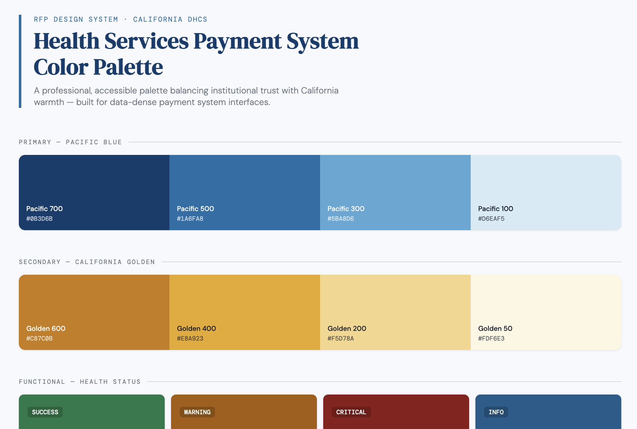
Visual Identity & Design System
Pre-launch visual identity work for a California public health initiative — establishing the design language that will carry the program across all public-facing touchpoints. Includes a mascot system built to make a government health program feel approachable and human, and a design system that gives future teams a consistent foundation to build from. Read More »
// produced Mascot design, character system, color palette, typography system, component library, design system documentation
// goal Make a state health program feel like something people want to engage with.